Brand Guidelines
Version 0.1
Brand Guidelines
Version 0.1
Updated 2022/12/13
This is a visual identity manual for the Astratex brand. Its purpose is to ensure that the visual communication of the brand is consistent across all online and offline channels. It serves as a guide for Astratex employees as well as all external suppliers. Anyone contributing to the preparation of visual materials must comply with the rules in this manual.
Like the brand, the manual needs to be regularly updated and adapted to new needs to fulfil its function as a tool for creating new or modifying existing visual formats in the long term.
The manual was prepared by Milk Studio.
Here is an overview of the individual elements that make up our brand. Think of them as tools in your brand toolkit.

Logo
Our logo is the primary expression of our brand. It should feature prominently in all internal and external communications.
Colours
Colour plays an important role in brand recognition. We have selected a set of primary and secondary Astratex colours.
Typeface
We created our own Astratex Sans typeface. It helps strengthen the look and feel of the brand and express the brand’s personality.
Visual and illustrative style
The visual and illustrative style can be used to deliver immediate impact by separating the logo and placing it as a dynamic element within the layout of the design.
Photography
Photography is the element that keeps visual communication consistent across formats of different sizes.
Lines, scribbles and quotes
Lines, scribbles and quotes are additional graphic elements and serve as identification and distinguishing elements of the brand.
Updated 2022/12/13
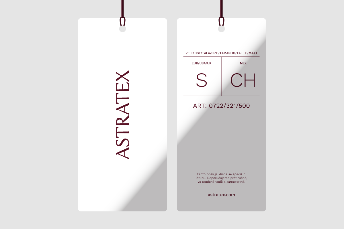
We use the logo wherever possible, exclusively in the form described in this manual. When working with the logo, we always use only the original variants from the Download section.
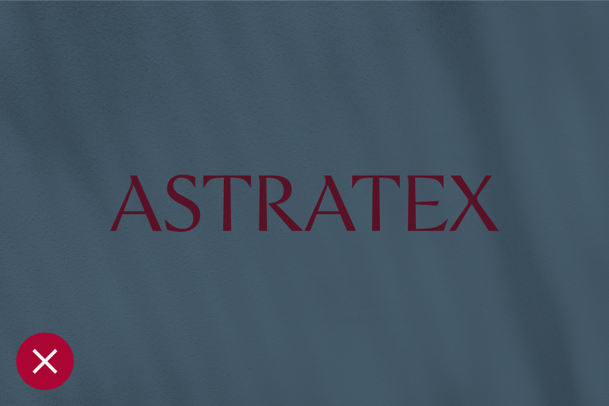
The wordmark below is the primary logo of Astratex.
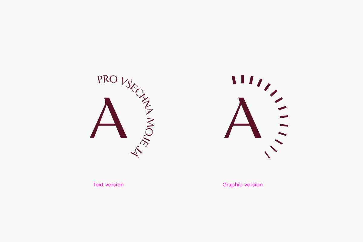
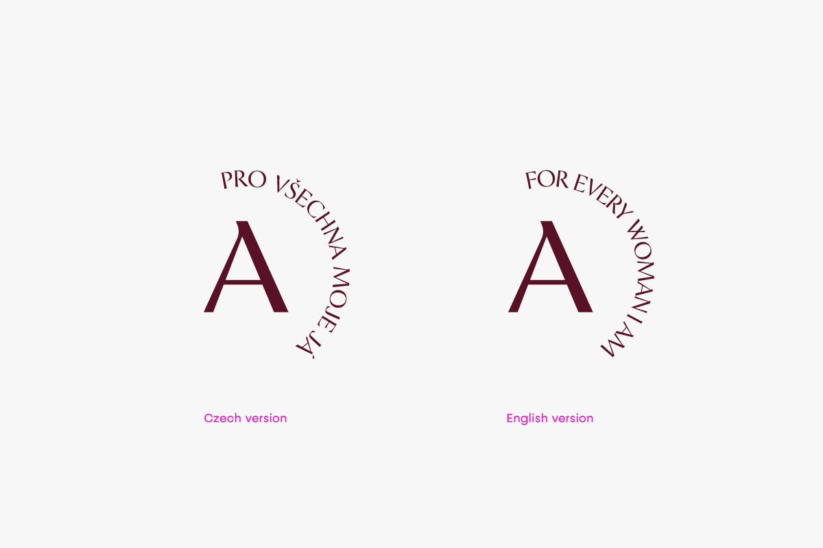
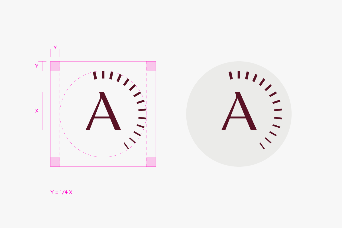
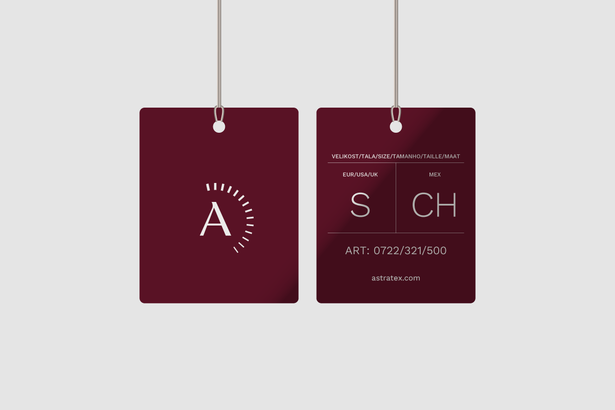
Below, there is a symbol (monogram) version of our logo. This version should mostly be used for profile images on social media.
The clear space is the zone around the logo that must not be interfered with by any other elements. This zone of our wordmark is determined by the “x-height”, which is a typographic unit that is measured from the baseline to the mean line.

To ensure the monogram is presented properly, please always use this example.
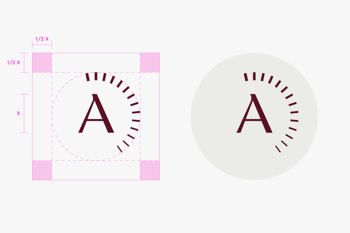
When using the logo, it must always be legible and recognisable. Therefore, we do not use it in a smaller size than specified below. The maximum size of the logo is unlimited as long as the prescribed protection zone is maintained.


The primary position for our wordmark is the top-left or bottom-left corner, locked to the margin. However, our wordmark position is flexible and can respond to the application content. Below are examples of alternative positions for our wordmark.

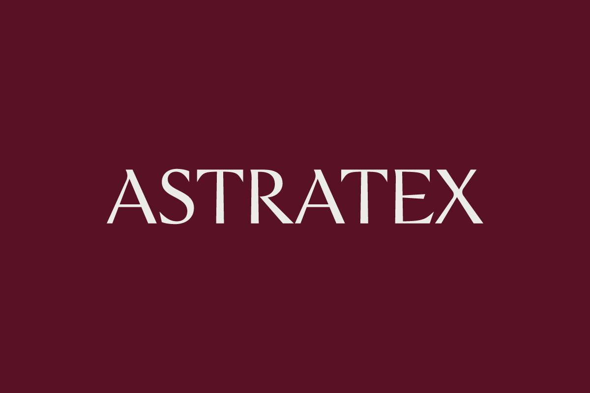
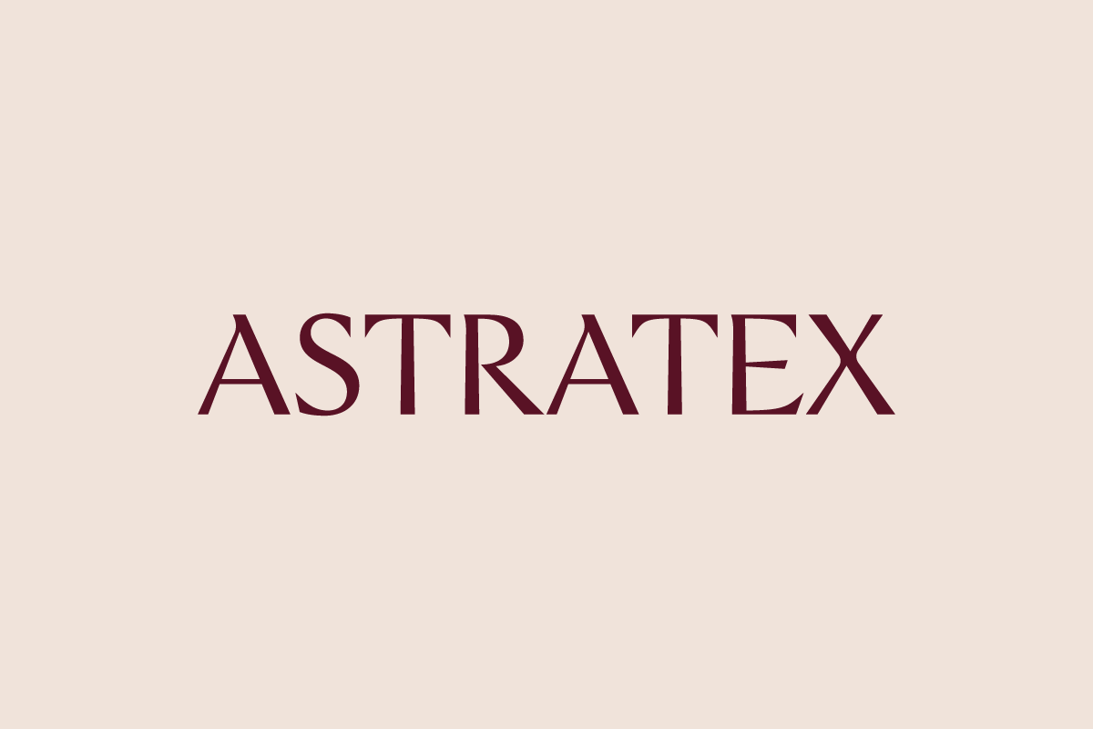
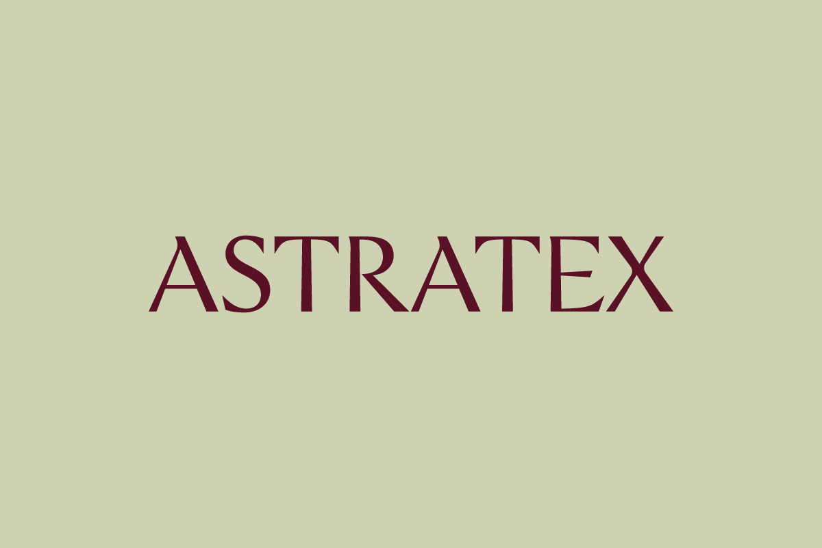
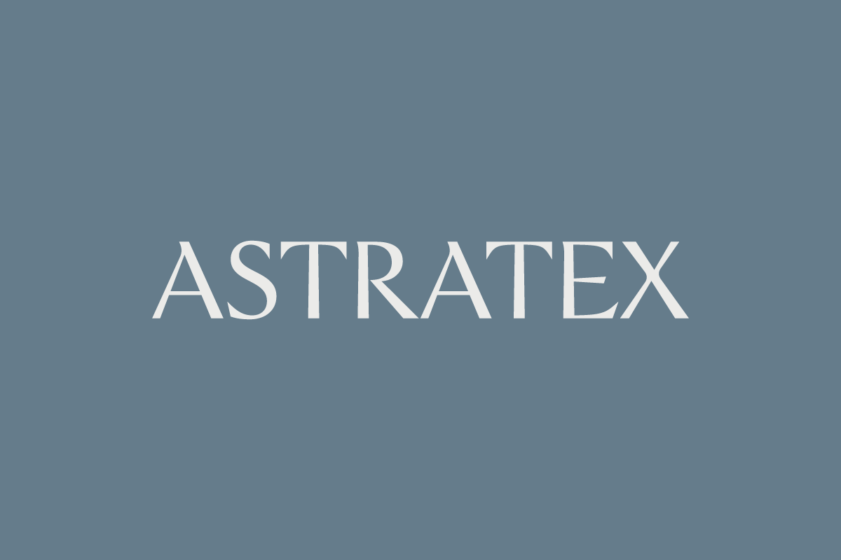
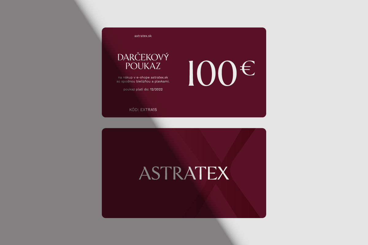
The burgundy logo should always be the first choice for any design. Where this is not possible, the other option (grey) can be used.
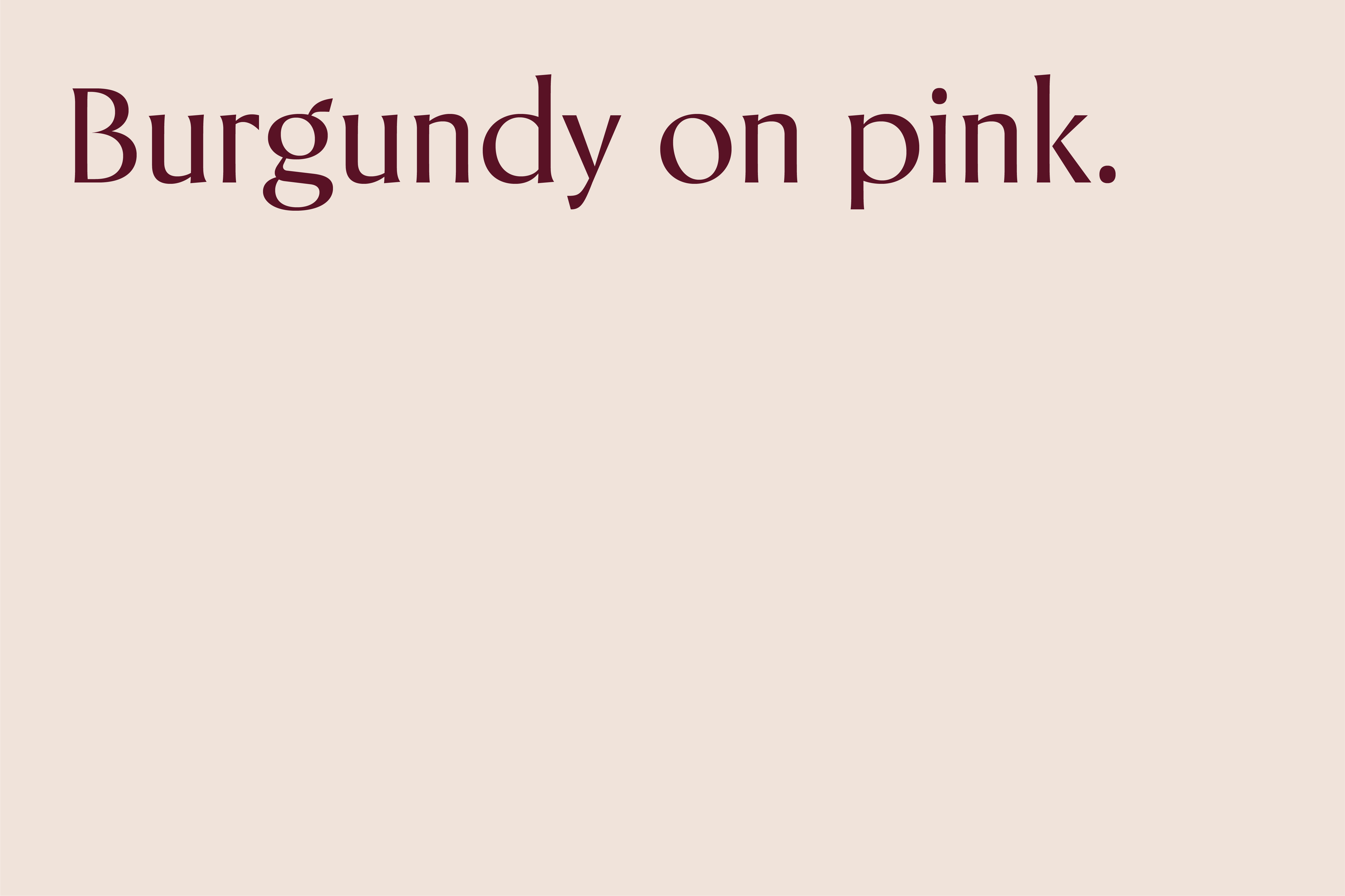
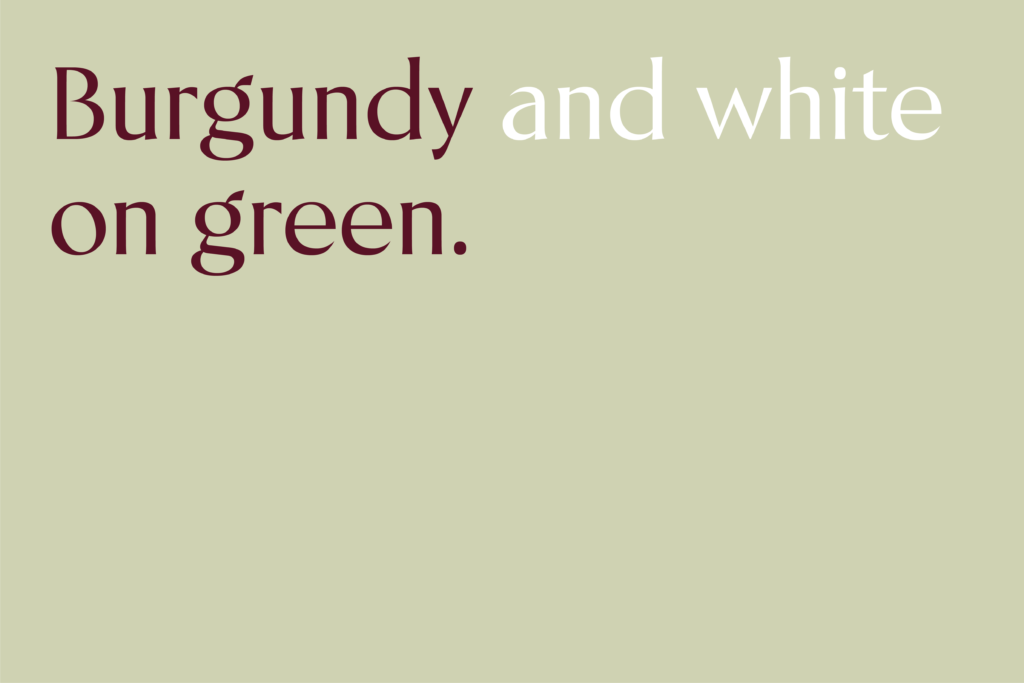
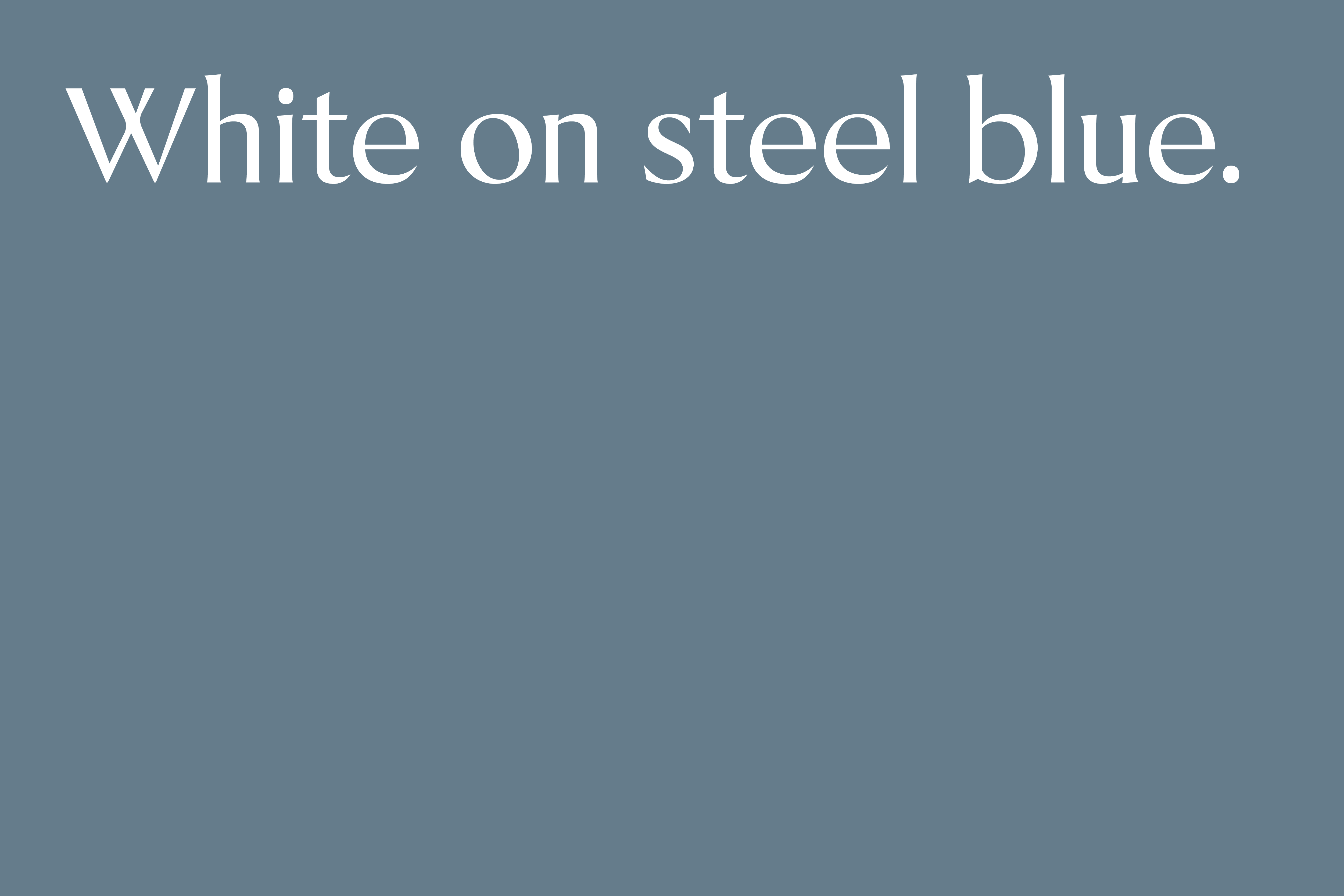
Burgundy logo on pink background should always be our first choice for any background-required design. Where this is not possible, other options (green, grey or steel blue) can be used to enhance the diversity of our brand.
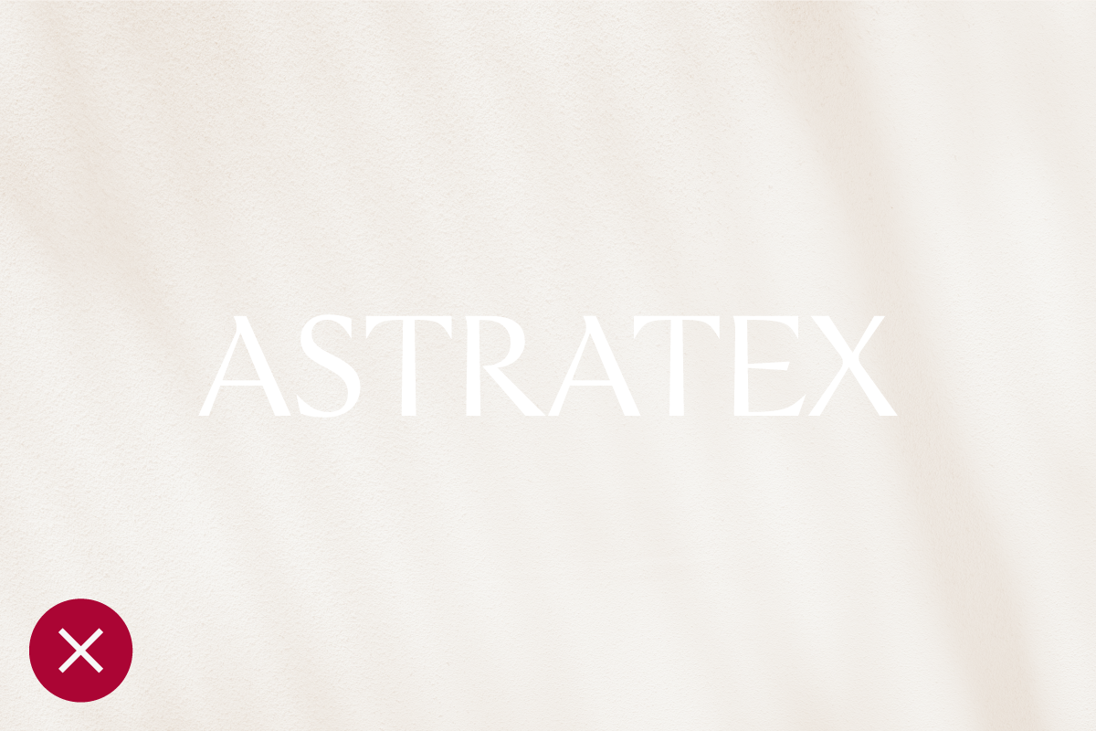
Our logo should always be the most vital and visible element of our communications. When working with photography, the colour and placement of the logo should always be considered carefully. Always choose backgrounds with plenty of contrast and simple forms to increase the logo’s legibility.


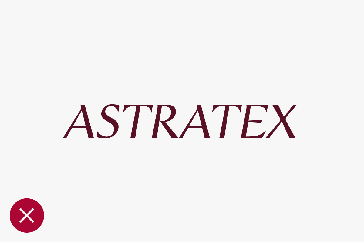
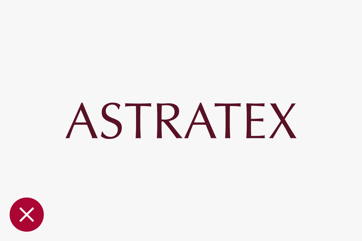
Examples of logomark misuse are shown here. These treatments are not acceptable. Any alteration of the logomark negatively affects the integrity of our brand. Please always use approved logomark artwork to ensure design consistency.

Updated 2022/12/15
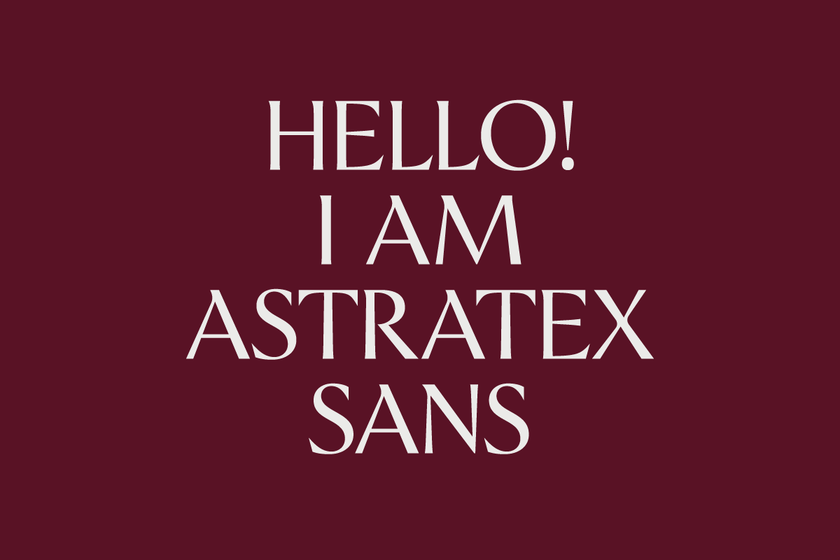
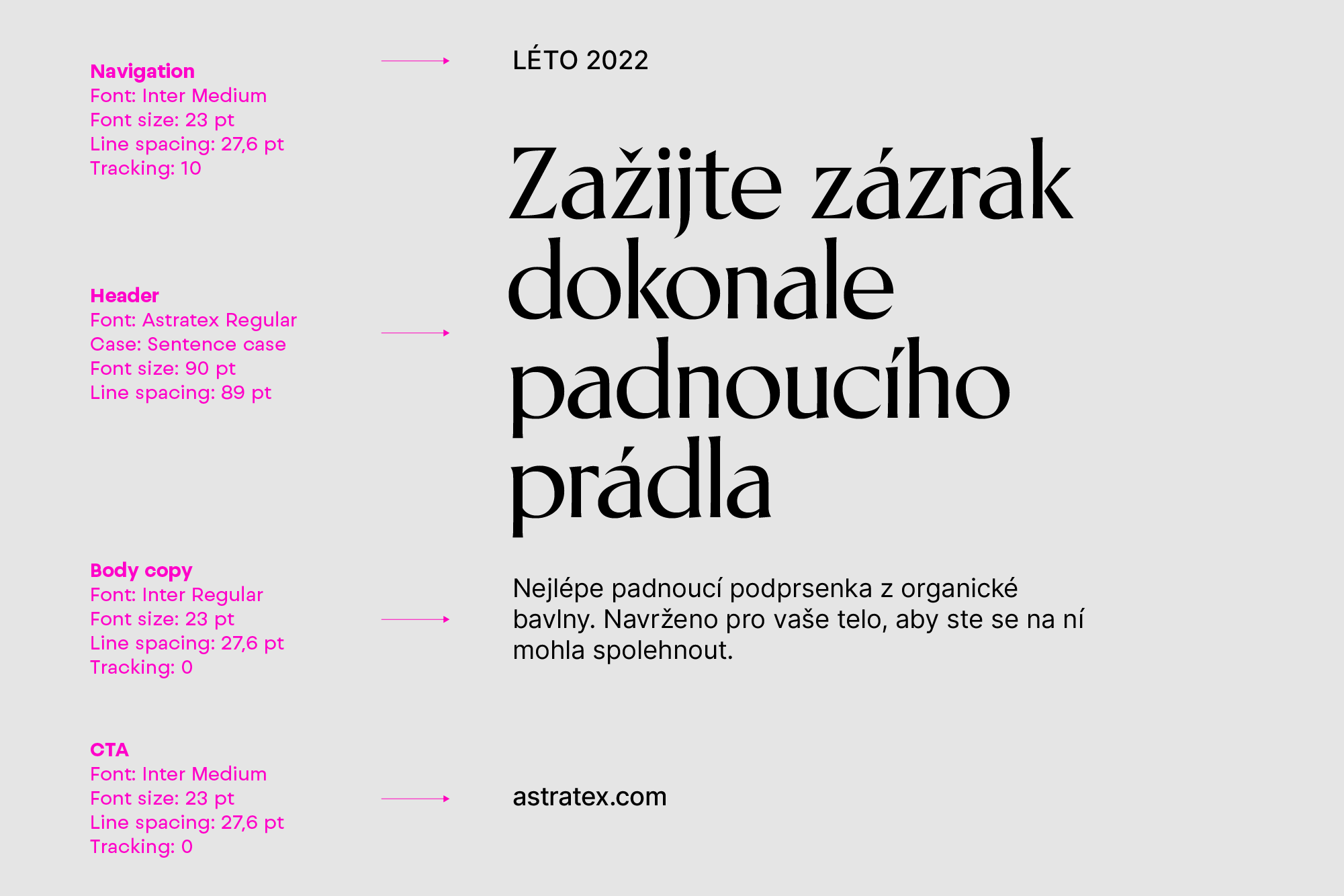
Our typography is clean, modern and elegant. It is a custom-designed typeface that works well across all our communication channels both online and offline.
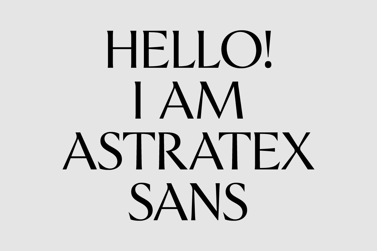

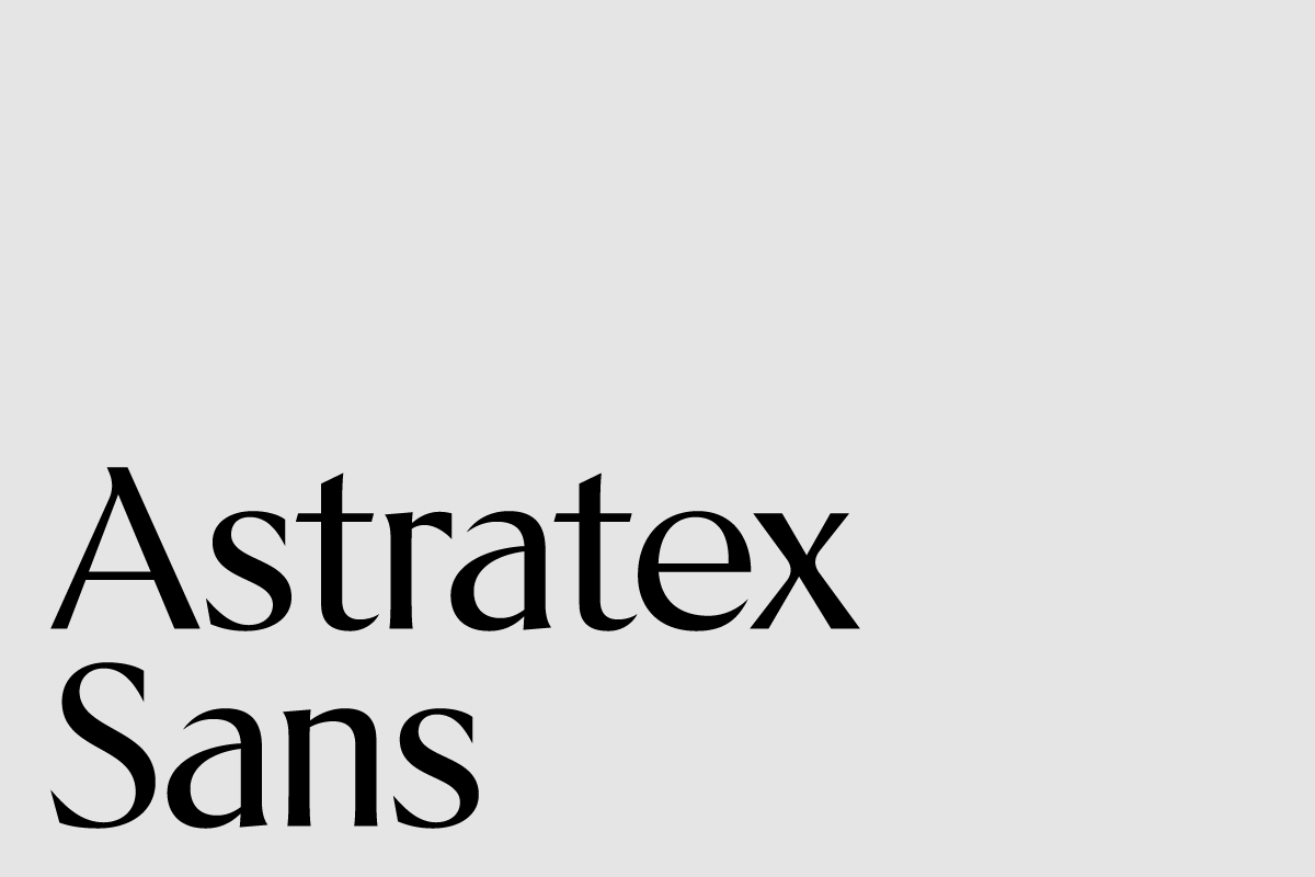
The primary brand typeface is our custom typeface, Astratex Regular. It works to strengthen the brand’s look and feel and to express the personality of Astratex. We use it for headlines.
Astratex Regular is an open source typeface, available for download at this link.
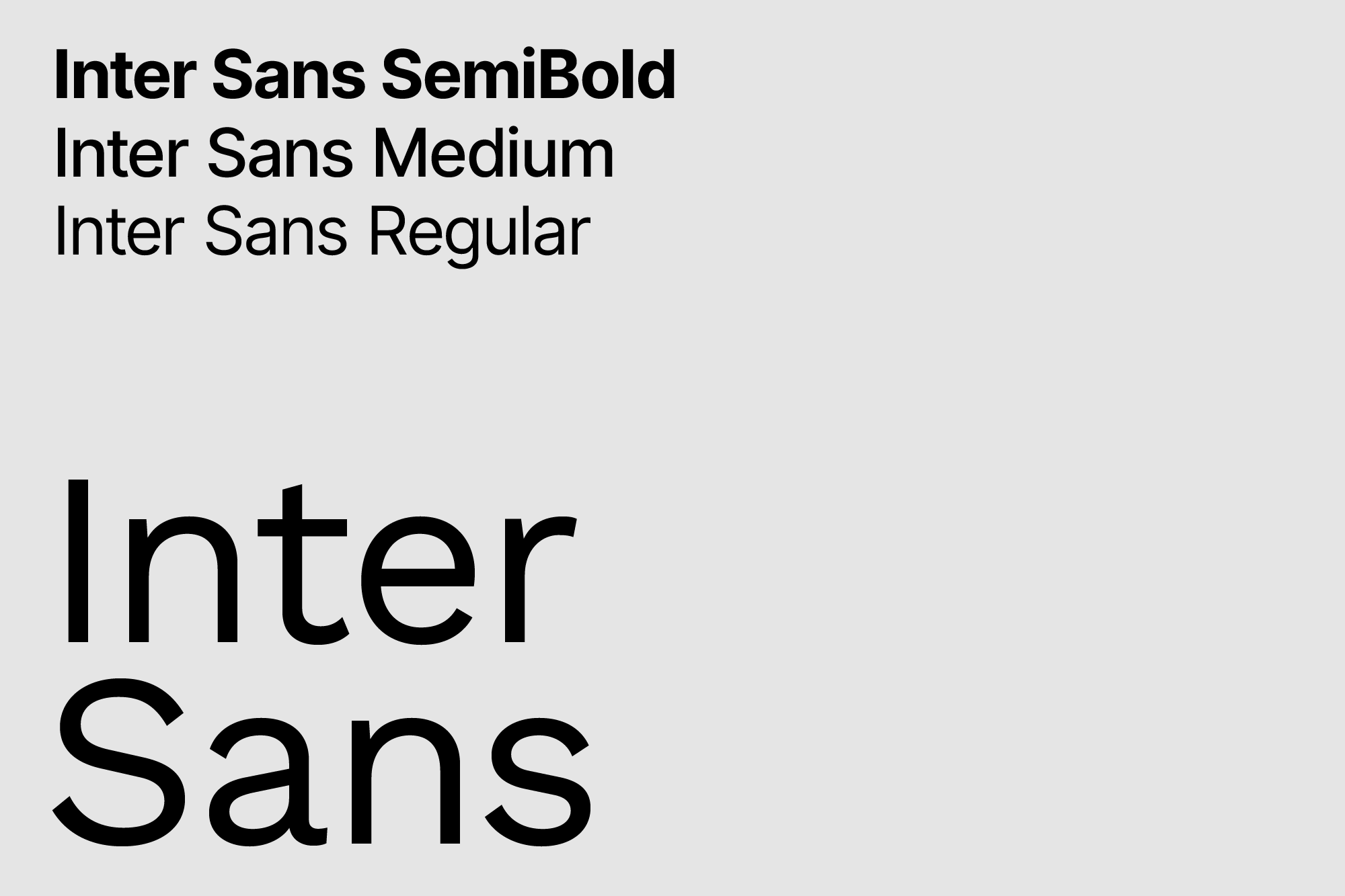
The basic text typeface of the brand is Inter Sans. We use the font in all brand communications in Regular, Medium and Bold. Work Sans typeface is free and available for download at this link.
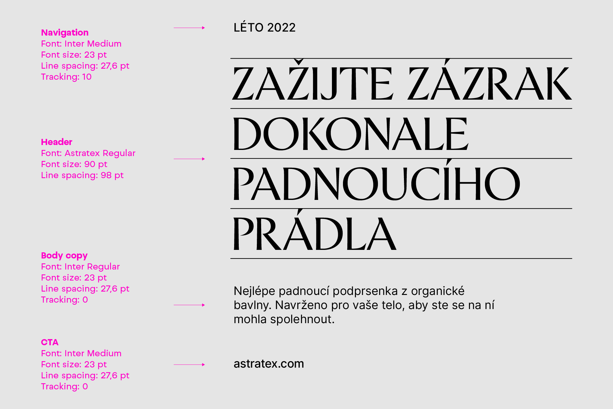
It is important to organise typography in a hierarchical system according to relative importance or inclusiveness through scale and function, depending on communication.

Updated 2022/12/13
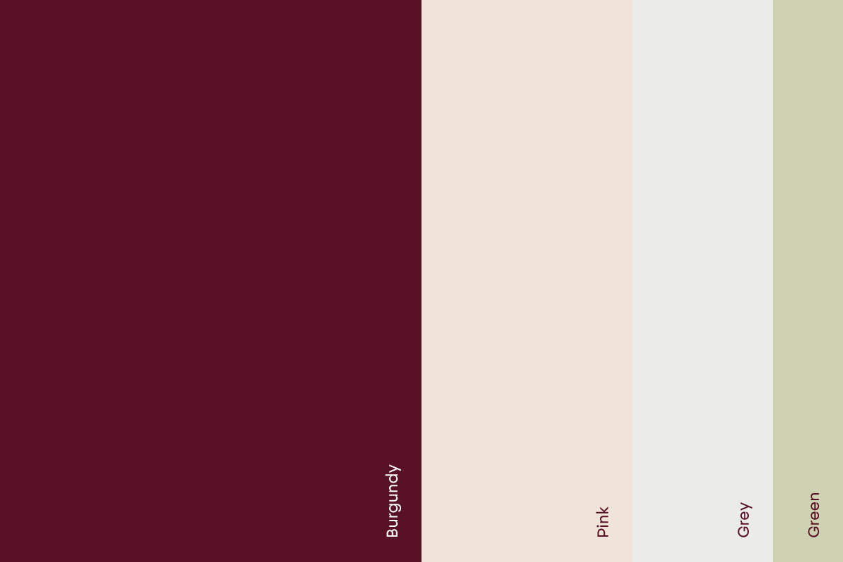
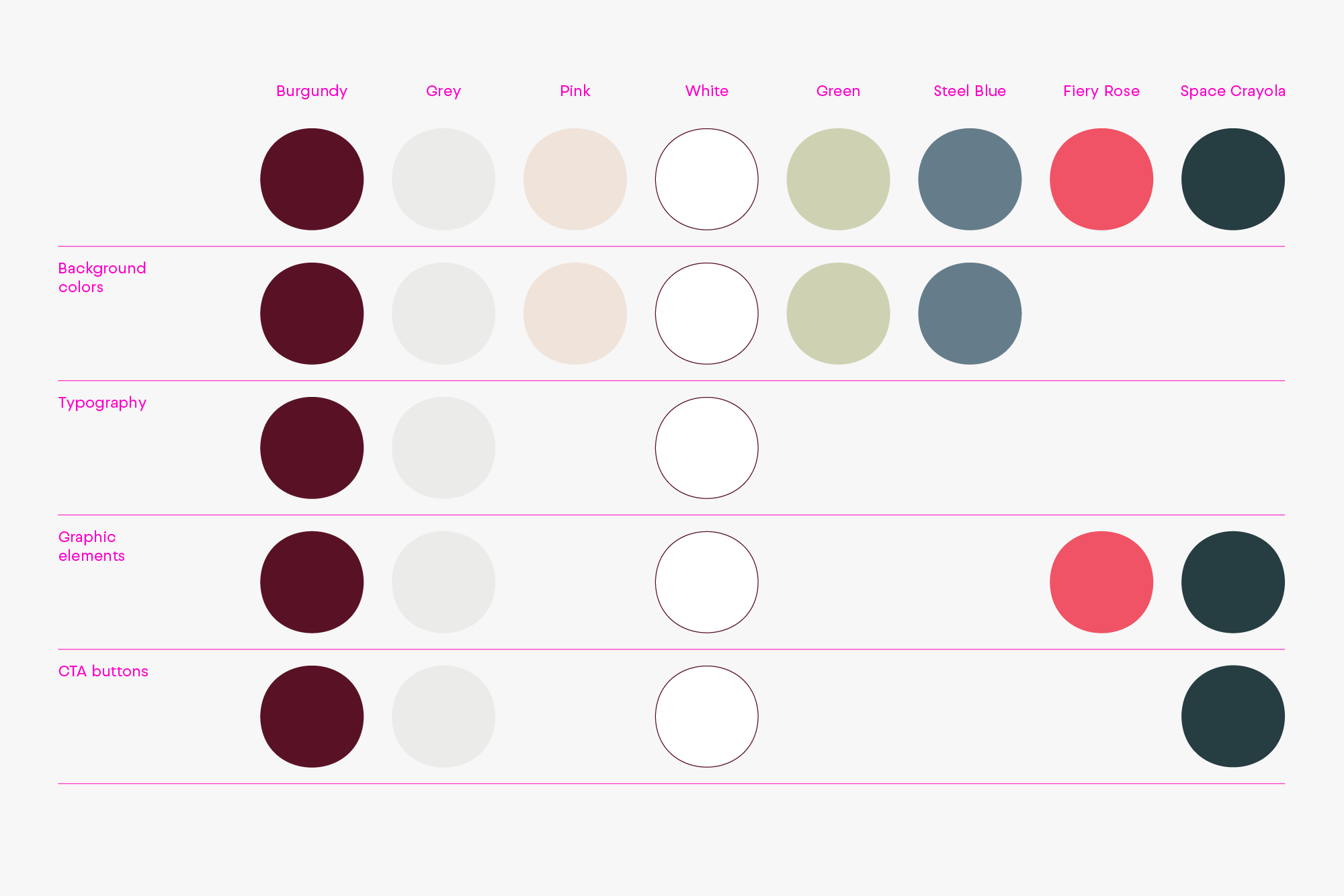
The use of colour is an important aspect of the Astratex identity. Therefore, always use the exact colour values listed to keep the brand consistent.
Pantone® colours as well as CMYK process colours are intended for use in printing. The RGB and HTML specifications are used with online and web interfaces, and provide appearance.
Our primary colours are burgundy, grey, pink and white.

Burgundy
RGB — 89 | 18 | 37
CMYK — 38 | 97 | 56 | 62
HEX — #591225
PANTONE — 209 C

Grey
RGB — 235 | 235 | 233
CMYK — 9 | 6 | 9 | 0
HEX — #EBEBE9
PANTONE — 427 C

Pink
RGB — 240 | 227 | 218
CMYK — 7 | 12 | 15 | 0
HEX — #F0E3DA
PANTONE — 7604 C

White
RGB — 255 | 255 | 255
CMYK — 0 | 0 | 0 | 0
HEX — #FFFFFF
The secondary colours complement our primary colours.

Green
RGB — 207 | 210 | 178
CMYK — 24 | 12 | 35 | 0
HEX — #CFD2B2
PANTONE — 5803 C

Steel Blue
RGB — 101 | 124 | 139
CMYK — 63 | 40 | 33 | 16
HEX — #657C8B
PANTONE — 2166 C

Fiery Rose (online use only)
RGB — 240 | 83 | 101
HEX — #F05365

Space Crayola (online use only)
RGB — 38 | 61 | 66
HEX — #263D42
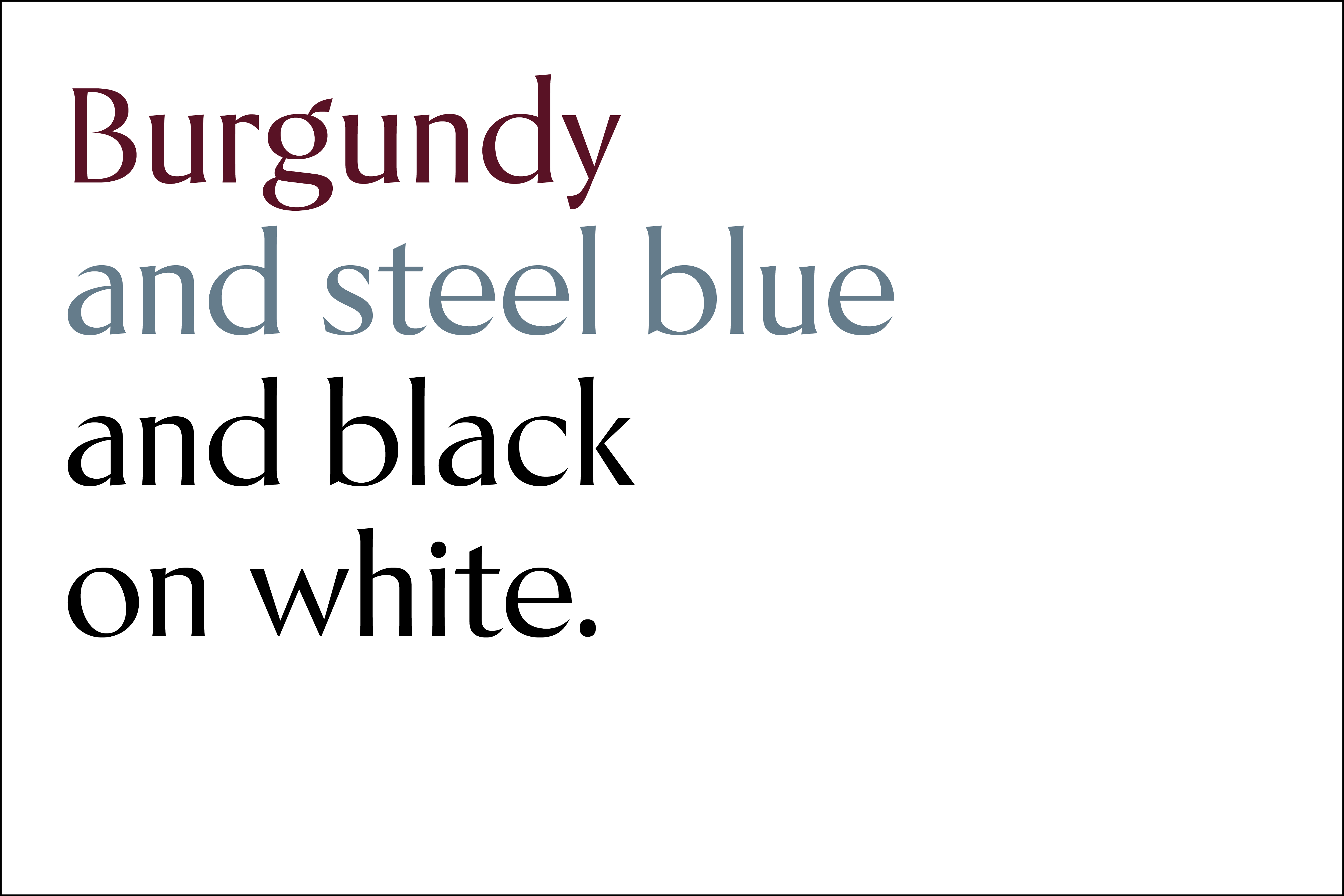
These examples should be used as a guide for selecting the correct option for your project. The following chart shows which colours to use for which purpose.
Updated 2022/12/15
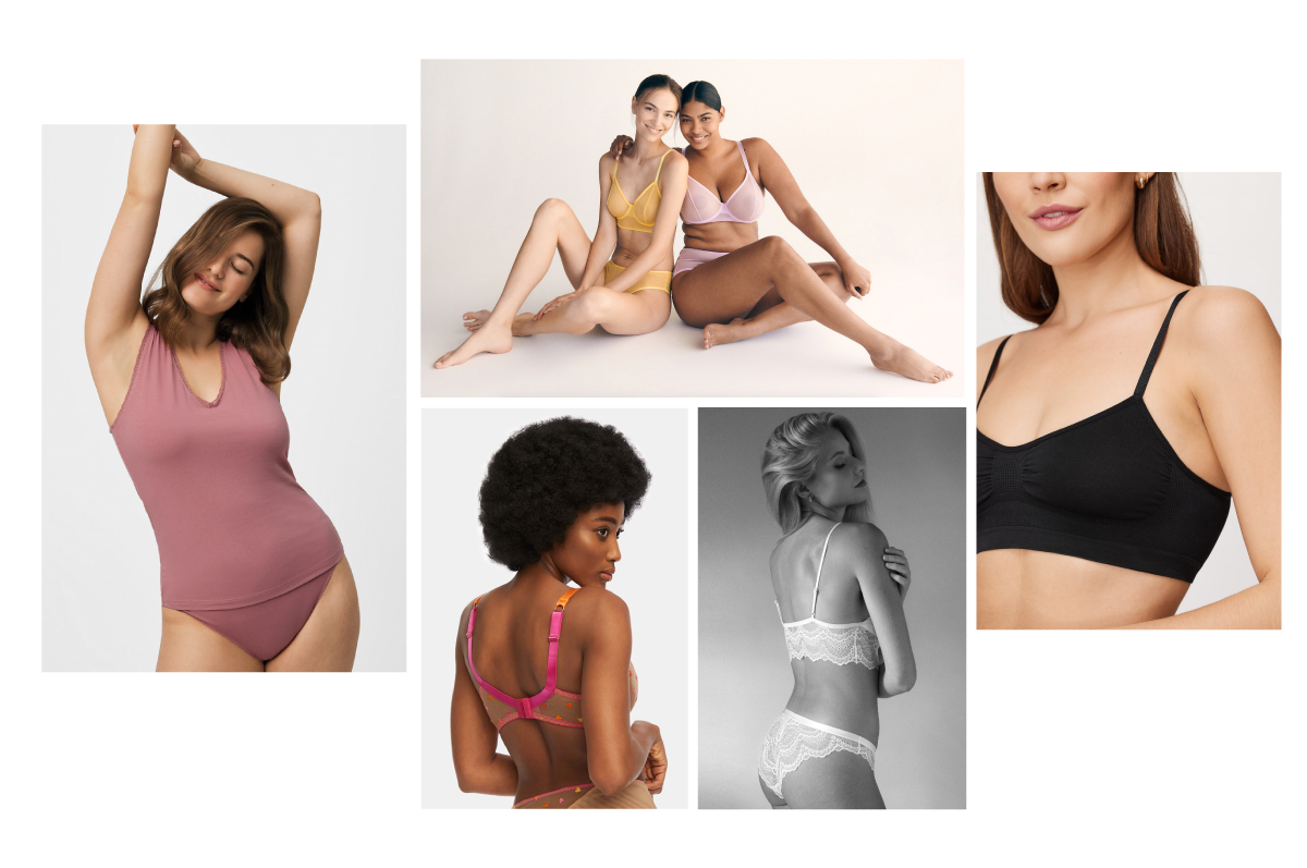
Photography is one of the strongest visual elements of our brand. Astratex imagery is a direct reflection of the way we see the world around us and ourselves in it.
To keep the tone of the brand consistent, follow the recommendations below.
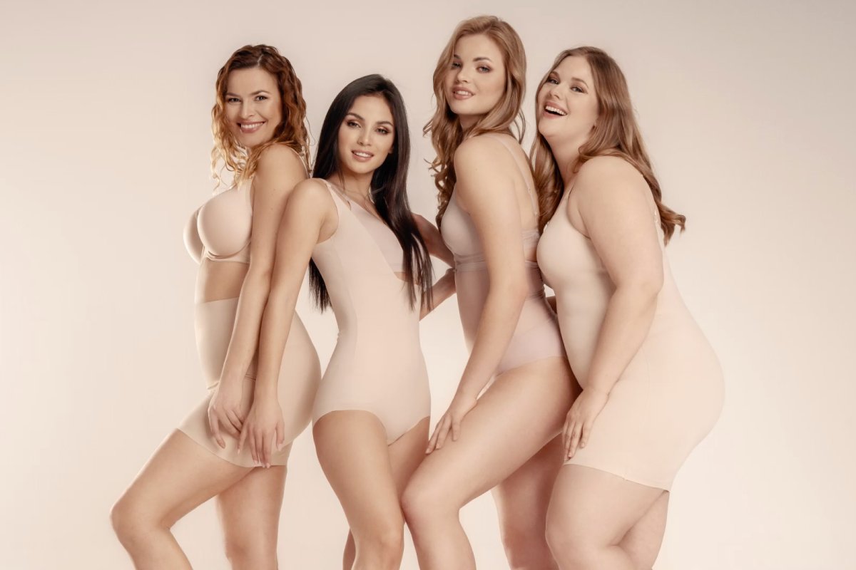
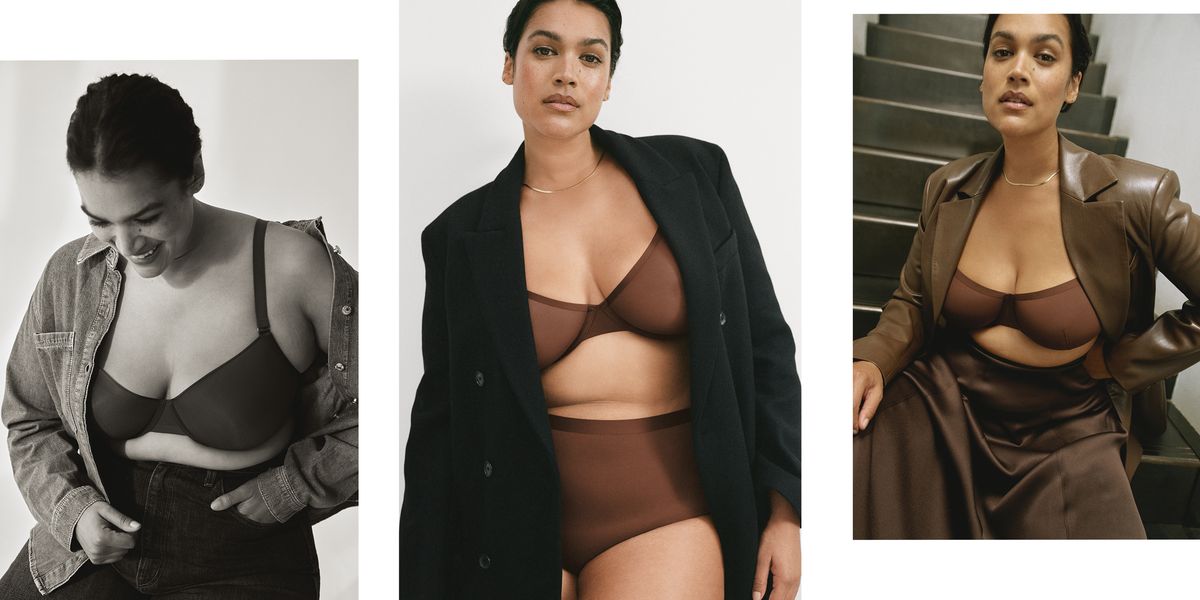
For every woman I am. We believe that beauty comes in many shapes and sizes – we believe in a diverse, inclusive and authentic beauty. We want women to feel good in their own skin at any given time and occasion, whether they are in a business meeting, at home or getting ready for a party. We want them to feel confident and in charge. That is what we try to show through our imagery.
These are the rules for creating Astratex imagery.
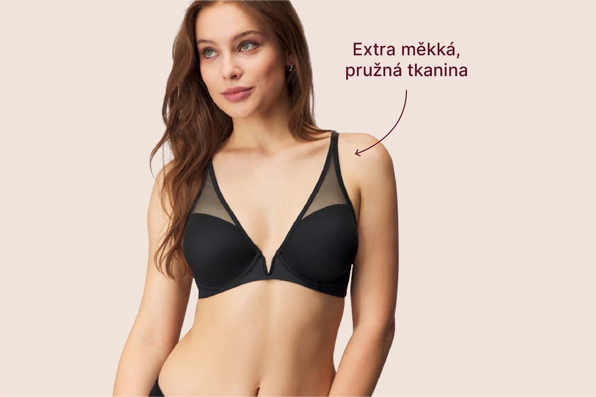
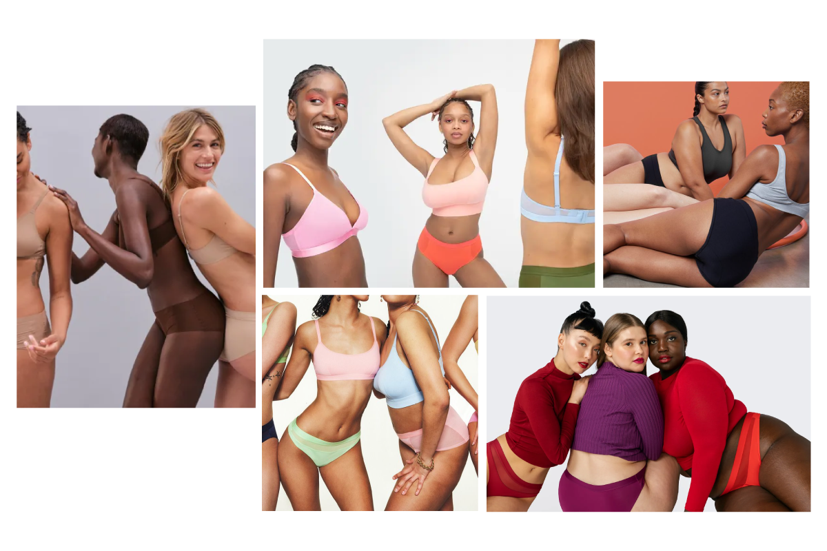
We show models of any shape, size, age or skin tone. We show women who feel good in their own skin, in poses that are relaxed and radiate self-confidence. They are not trying to hide any ‘imperfections’, as we believe that every body is beautiful. The styling should be natural (avoid using strong makeup). Post-production / retouching should respect authentic beauty.
When the models and styling are not in line with our values and our brand story, we recommend using photos of the product only.
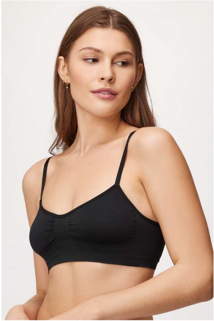
Do
Soft light, confident pose, body slightly tilted, natural makeup and styling.
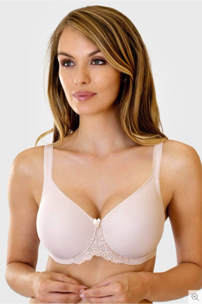
Don’t
Hard light, high contrast, stiff pose, hair and makeup styling that is out of date.

Do
No hard retouching, authentic image of the body, styling is more natural.
Don’t
Visible computer retouching, hair and makeup styling is too colourful and strong.
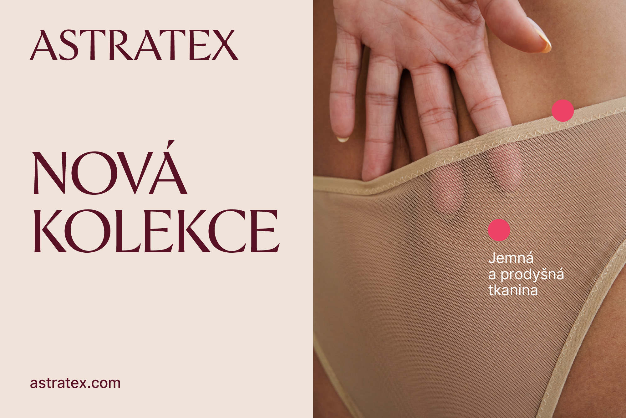
The purpose of lifestyle photography is first and foremost to attract and engage the viewer. The emphasis should be on the product; the setting/the scene is there to support the mood and the story of the particular product or the whole product line. The body language should feel very natural.
For product photography, we want all eyes on the product. We use studio photography with a simple background (ideally using colours from our brand palette). We use multiple crops (detail, half-body, full-body) for a more diverse product display. Poses are relaxed and diverse, and radiate confidence and body positivity.

When shooting multiple models, we recommend orchestrating compositions and interactions between models that feel natural, relaxed and interesting. We can play with the depth of the image as well or photo-crops.
Do
Always try to use a background that lets the product stand out. Create poses and compositions that are interactive and relaxed.
Don’t
Using a low-contrast background makes the product less visible. The models take separate positions and their posing seems very stiff.

Do
Diverse cast of models, contemporary styling, soft light, soft background.

Don’t
No diversity in models, over-sexualised styling, hard light, background colour is too vivid.
Updated 2022/12/13
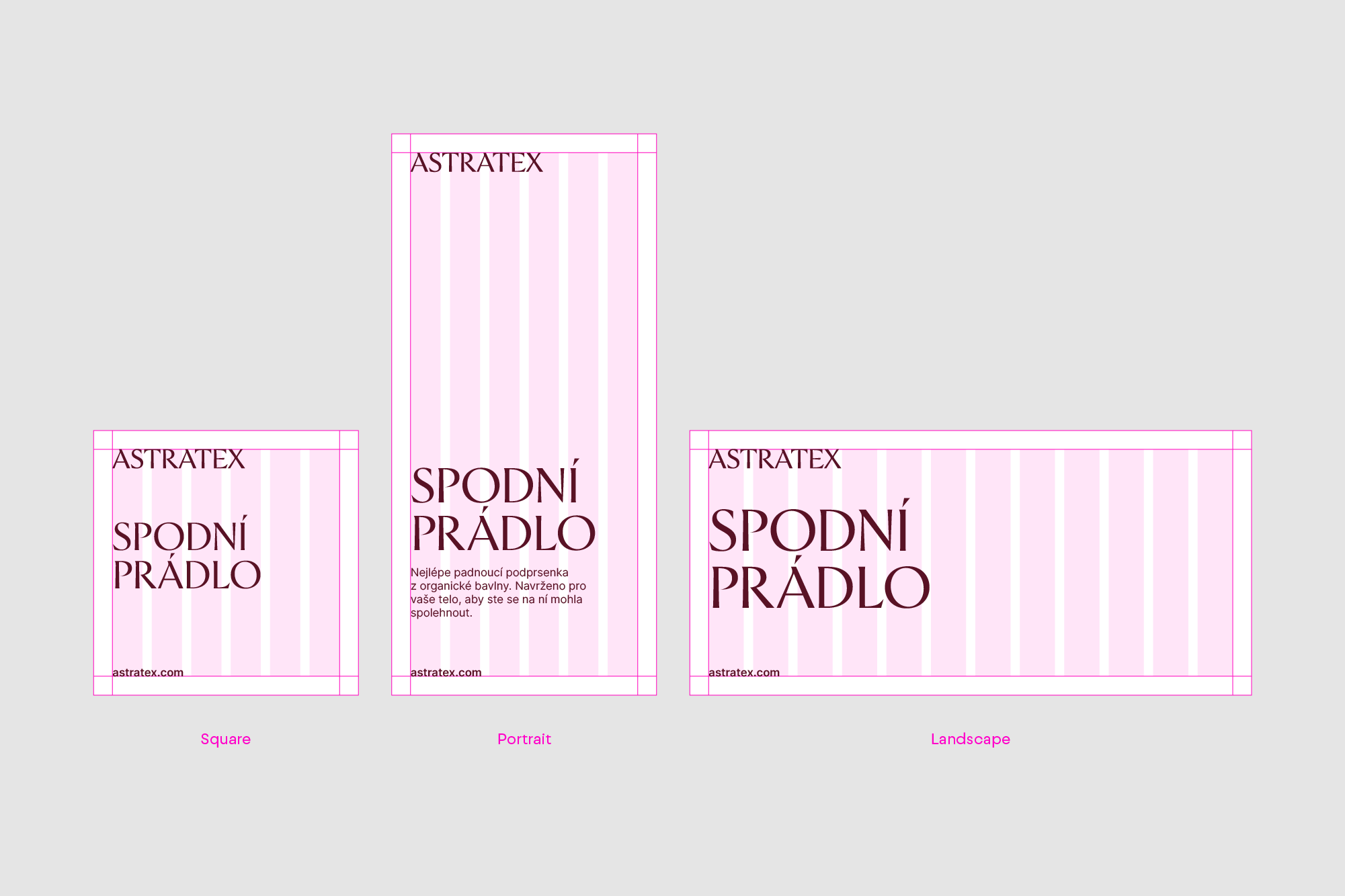
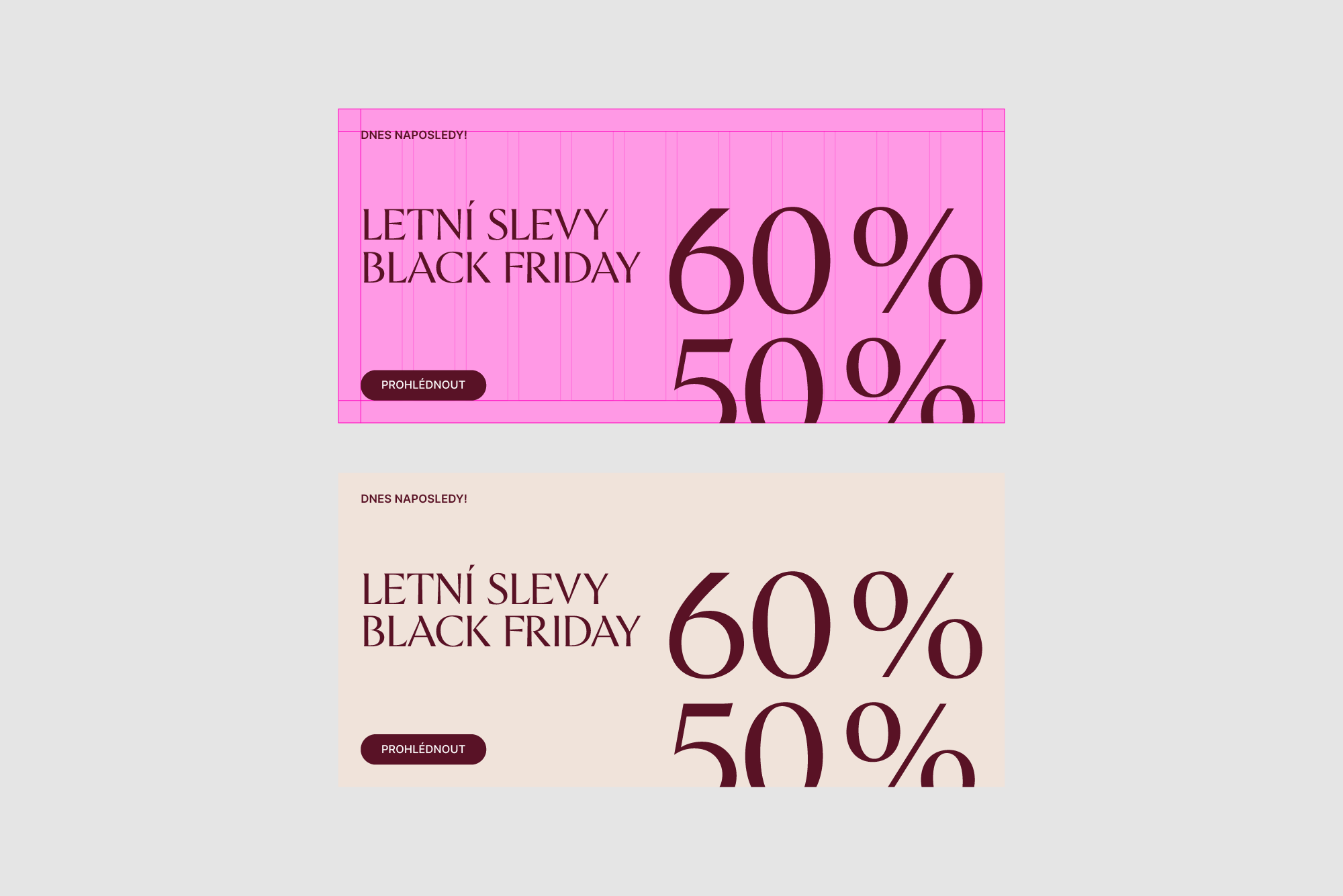
The grid system maintains a consistent visual identity for the Astratex brand.
The column grid is the underlying grid divided into six columns. It creates an ideal framework for marketing literature..
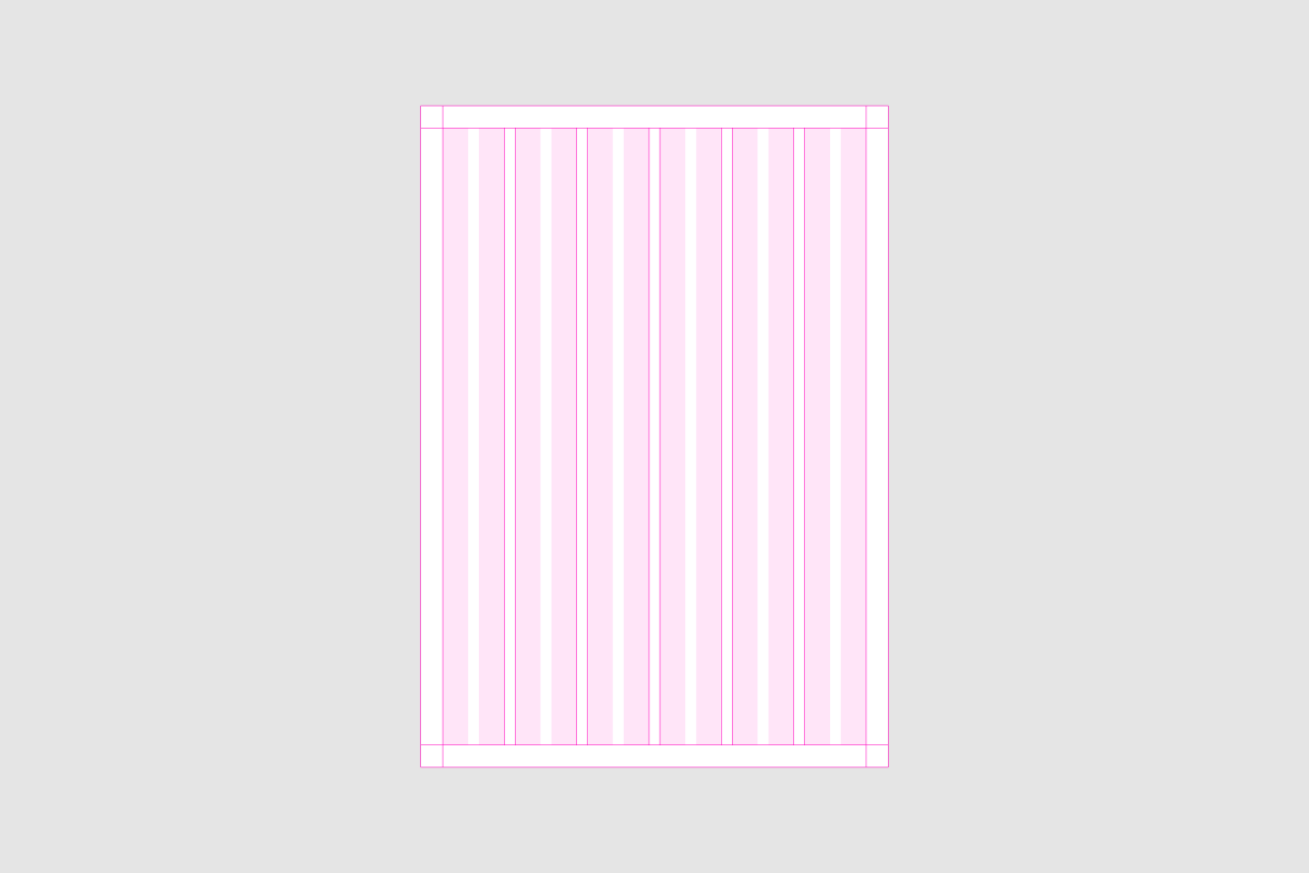
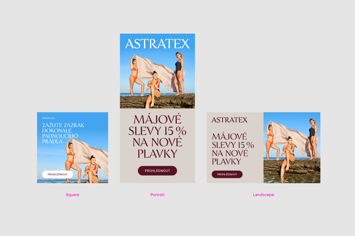
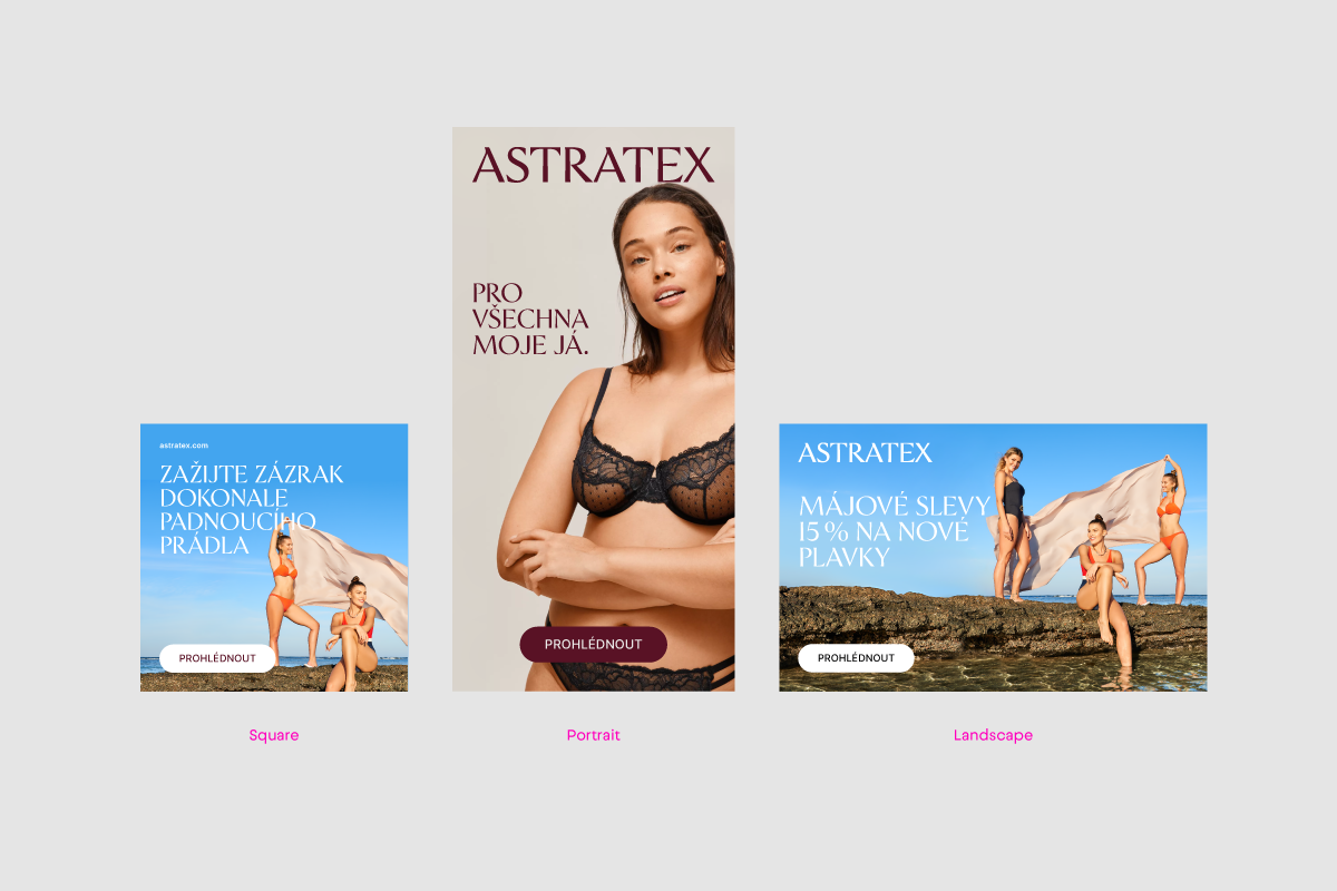
Below is how we use the column grid and create different formats.
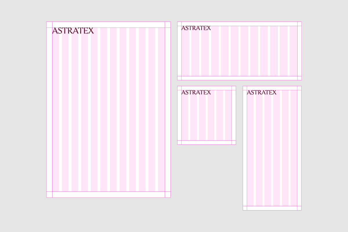
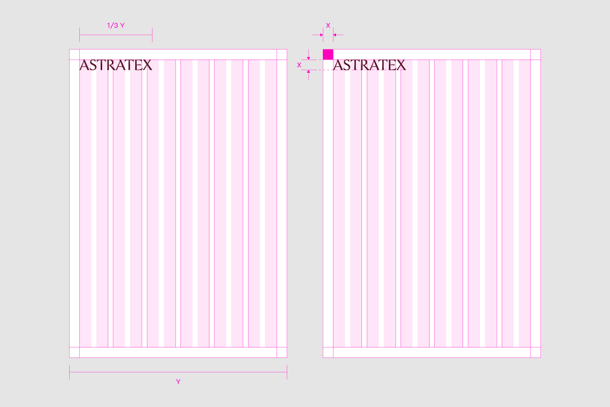
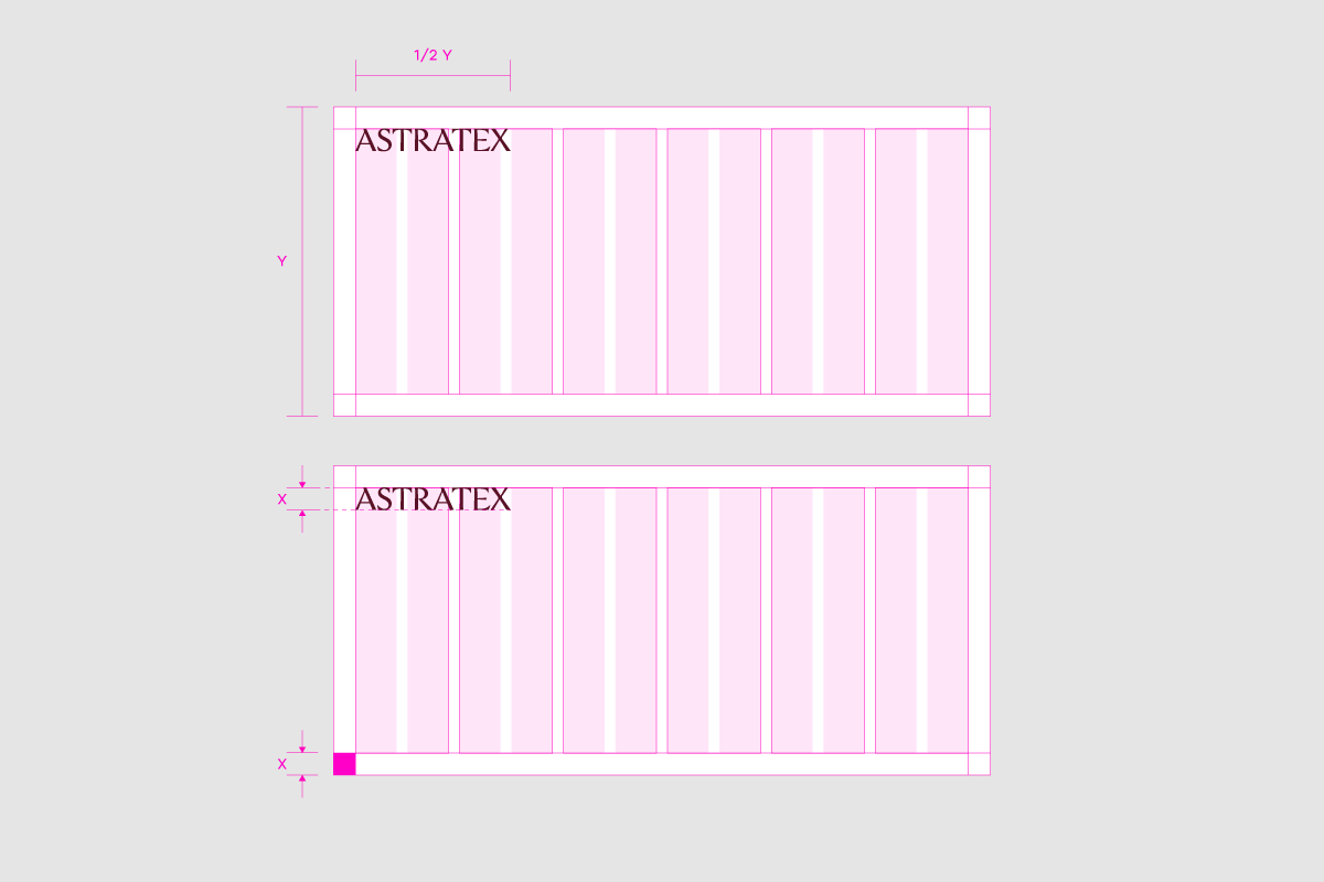
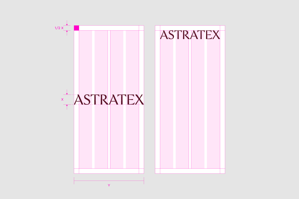
Proper margin sizing is required to maintain consistent communication. The size of the margins is defined by the height of the logo and its relation to the shorter side of the format. Always set the size of the margins according to the examples below.
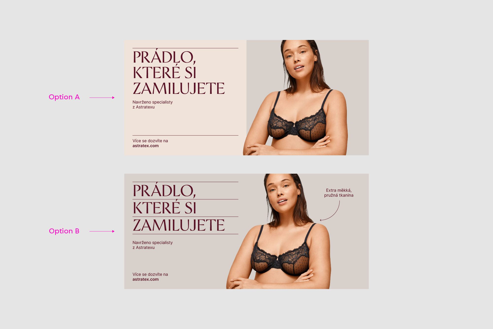
These are the options for working with composition using text, elements, with or without images.

Lines are our optional visual element. They help diversify communication and visually separate content.

When working with lines, you can choose from the two options below.
To keep the line thickness consistent, use the following formula.

Updated 2022/12/13
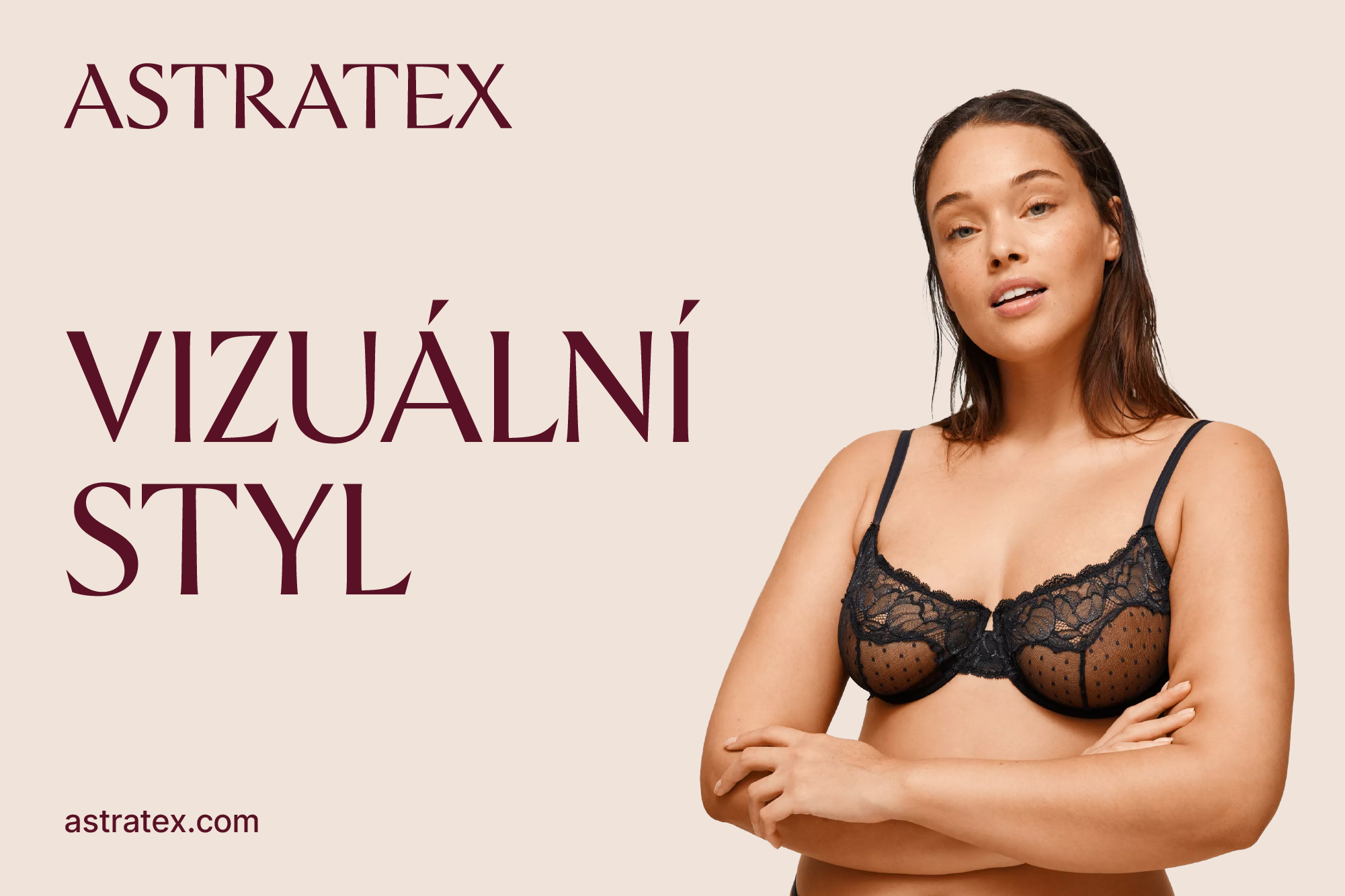
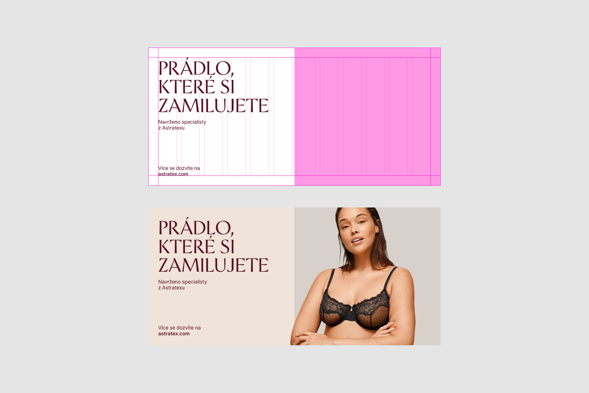
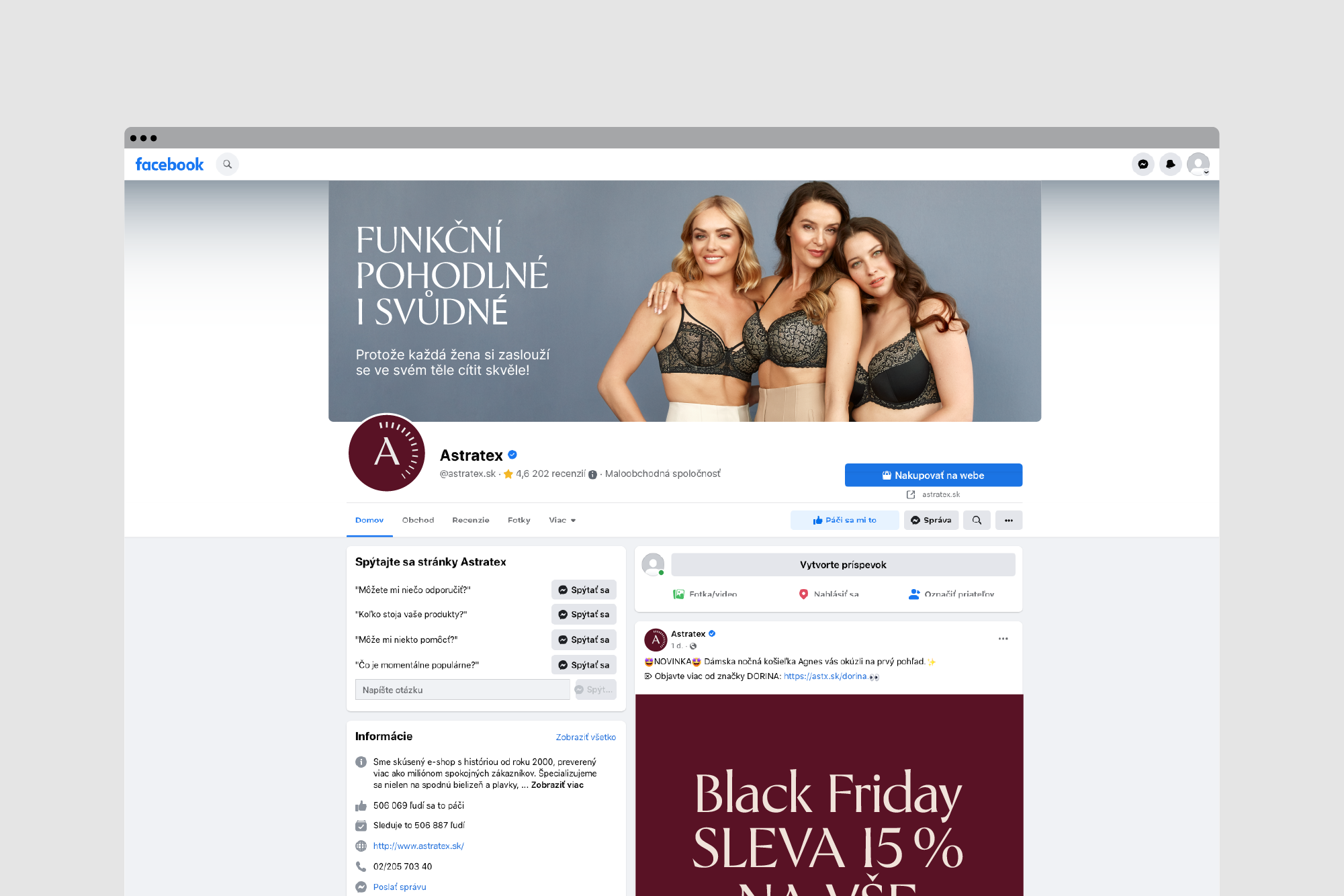
This section demonstrates how the visual elements work together and shows how the brand works altogether as a whole.


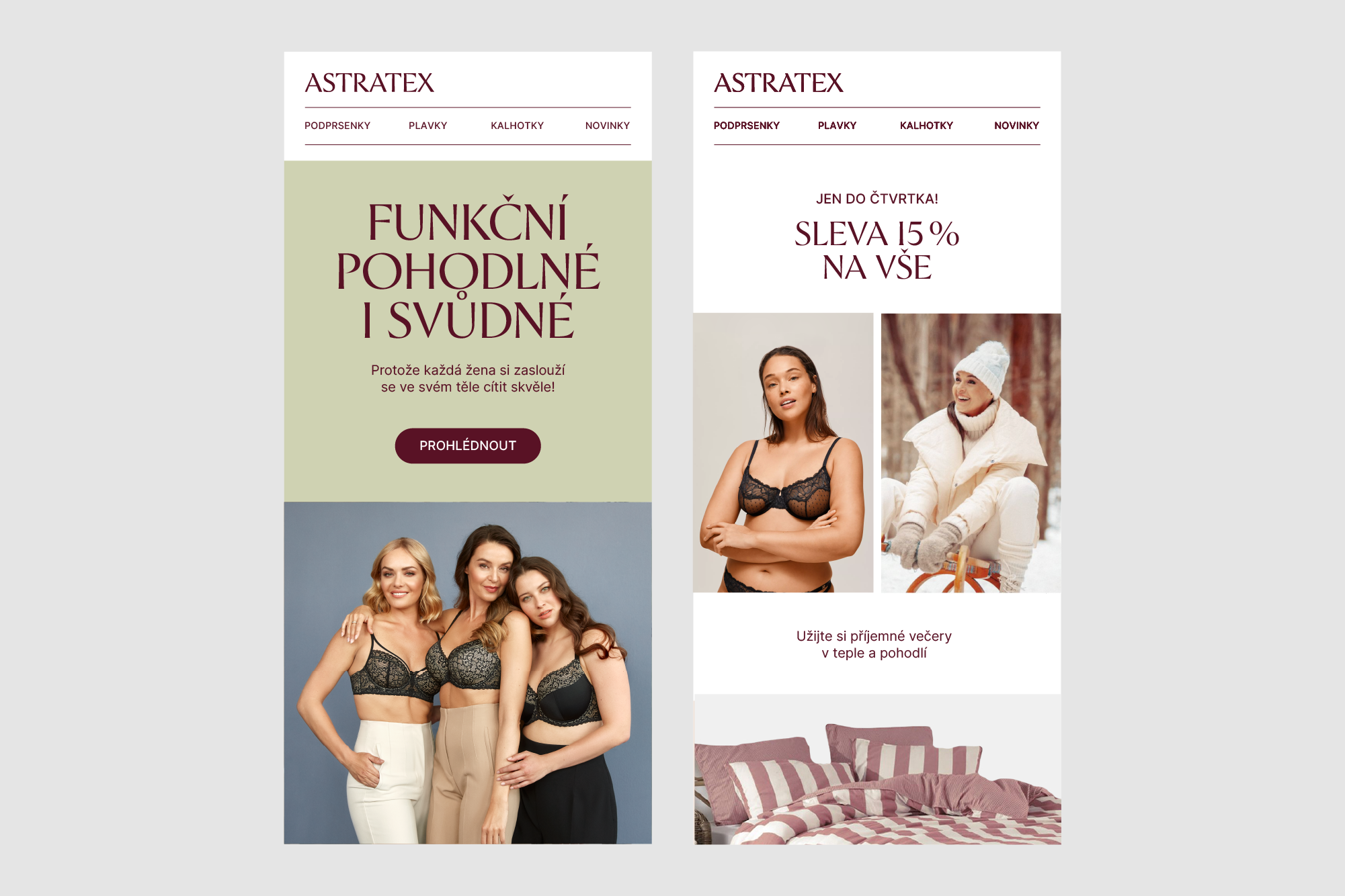

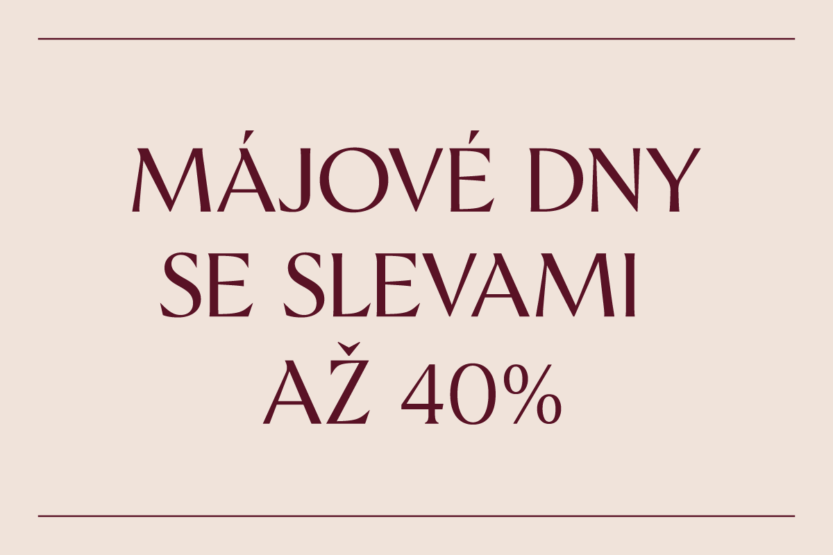
When creating campaign or sales visuals, we can use the Astratex typeface in uppercase or lowercase for more flexibility.

Updated 2022/12/05